Microsoft Updates Office Default Themes and Fonts.

Microsoft Updates Office Default Themes and Fonts
Calibri has been the default font of Microsoft Office for the past 15 years, but September is bringing several changes to the way users interact with Office. Microsoft is currently testing a new default theme that will roll out to all Microsoft 365 subscribers next month. This refreshed theme comes with the new Aptos font, a new color palette, styles, and updated default line weights.

Out with Calibri, In with Aptos
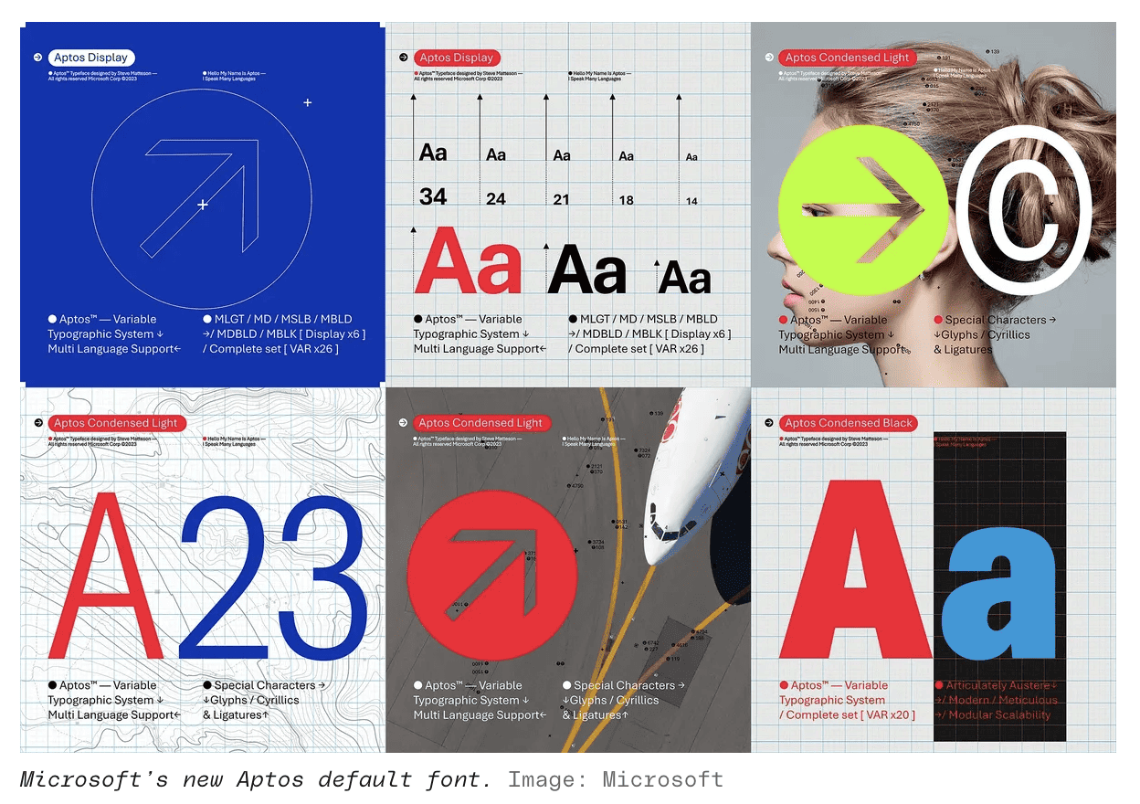
Over the past few years, Microsoft has been searching for a new default font to take the place of Calibri. After a long search and multiple options designed, Aptos was chosen. While Aptos will replace Calibri as the default font, Calibri will still be pre-pinned to the top of a new font menu alongside its predecessors, Times New Roman and Arial.
Calibri has been the default Office font since the release of Office 2007 when it replaced Times New Roman. Some entities, like the US State Department, have only recently started requesting employees to use Calibri, a full 16 years after its move to default. At that pace, it may take another decade or two for them to shift over to Aptos.
Aptos was created by Steve Matteson, a leading type designer. Matteson previously created Segoe, which Microsoft licensed for use as the Windows default font. Microsoft started using the Segoe UI font subfamily in Windows Vista, which is still used in Windows 11 today. Matteson also developed the original Windows TrueType core fonts. Aptos, previously known as Bierstadt, was renamed after Matteson’s favorite unincorporated town in Santa Cruz, California.
Visually, Aptos’ stroke endings are clearly cut off, but there’s some subtle softening to avoid the rigid grid-based typography you usually find with a font like this. Helvetica is the most famous example of a similar type of font.

Additional Changes
The font change for Office comes alongside changes to default style and color palette used in documents. The biggest change to the color palette is the removal of yellow, which is now replaced with dark green, while one of the lighter blues has been replaced with a dark teal color. This should not only result in better contrast between lines and shapes, but may help individuals with color blindness as the colors and contrasts are easier to discern.
The default style in Word and Outlook is also being refreshed to make it easier to read, navigate, and appear more professional. Microsoft has been testing these upcoming changes with Microsoft 365 Insiders throughout July and will begin the final preparations to send it live on September 17.


